visualization_lecture
Edward Tufte’s recommendations for data visualization
Slides
Overview
Edward Tufte is a renowned expert in the field of data visualization and information design. His work emphasizes clarity, precision, and efficiency in presenting data. Here are some of his key recommendations for effective data visualization:
- Maximize Data-Ink Ratio: Tufte advocates for minimizing non-essential ink in visualizations. This means removing any elements that do not convey important information, such as excessive gridlines, borders, or decorative graphics.
- Avoid Chartjunk: He warns against “chartjunk,” which refers to unnecessary or distracting elements in a chart that do not improve understanding. This includes things like 3D effects, excessive colors, and ornamental graphics.
- Use Small Multiples: Tufte suggests using small multiples (a series of similar graphs or charts) to compare different datasets or variables. This allows viewers to easily see patterns and differences across multiple dimensions.
- Show Data Variation: Instead of just showing averages or totals, Tufte encourages visualizations that display the full range of data variation. This can be done through techniques like scatter plots, box plots, or histograms.
- Integrate Text and Graphics: Tufte emphasizes the importance of integrating text and graphics seamlessly. Annotations, labels, and explanations should be placed close to the relevant data points to enhance understanding.
- Use Clear and Simple Design: Tufte advocates for a clean and simple design that prioritizes clarity. This includes using legible fonts, appropriate color schemes, and avoiding clutter.
- Focus on the Data Story: Every visualization should tell a clear story about the data. Tufte encourages designers to think about the message they want to convey and to design their visualizations accordingly.
- Consider the Audience: Understanding the audience’s needs and level of expertise is crucial. Tufte advises tailoring visualizations to ensure they are accessible and meaningful to the intended viewers.
Assignment based on Tufte’s Principles
Using a dataset of your choice, create a data visualization that adheres to Edward Tufte’s principles. Your visualization should:
- Maximize the data-ink ratio by removing any non-essential elements.
- Avoid chartjunk and focus on clarity.
- Use small multiples if applicable to compare different aspects of the data.
Another assignment based on Tufte’s Principles
Choose a complex dataset and create a series of visualizations that:
- Show data variation clearly, using appropriate chart types.
- Integrate text and graphics effectively to enhance understanding.
- Focus on telling a clear data story, tailored to your intended audience.
Python Code Example (Tufte Style Visualization)
Installation
- setup a virtual environment
python -m venv venv_viz
source venv_viz/bin/activate
- install the required packages
pip install -r requirements.txt
Code
- If you want to run the notebooks in Colab, you can also use the Open in Colab badge below:
![]()
import matplotlib.pyplot as plt
import numpy as np
import pandas as pd
import seaborn as sns

# Sample dataset
data = pd.DataFrame({
    'Category': np.repeat(['A', 'B', 'C'], 100),
    'Value': np.concatenate([np.random.normal(loc, 1, 100) for loc in [5, 10, 15]])
})

# Set Tufte style
sns.set_context("talk")
sns.set_style("white")

# Create a boxplot to show data variation
plt.figure(figsize=(8, 6))
sns.boxplot(x='Category', y='Value', data=data, hue='Category', palette='pastel', legend=False)
plt.title('Boxplot Showing Data Variation by Category', fontsize=16)
plt.xlabel('Category', fontsize=14)
plt.ylabel('Value', fontsize=14)
plt.grid(False)  # Remove gridlines for clarity
plt.show()
- This code creates a boxplot that adheres to Tufte’s principles by maximizing the data-ink ratio, avoiding chartjunk, and clearly showing data variation.
Time series data visualization example
import pandas as pd
import numpy as np
import matplotlib.pyplot as plt
import seaborn as sns

# Generate sample time series data
dates = pd.date_range(start='2023-01-01', periods=100, freq='D')
np.random.seed(42) # for reproducibility
data_ts = pd.DataFrame({
    'Date': dates,
    'Value': np.cumsum(np.random.randn(100) * 5) + 100
})

# Set Tufte style context (already set, but good to include for standalone)
sns.set_context("talk")
sns.set_style("white")

plt.figure(figsize=(10, 6))

# Plot the time series data with minimal elements
plt.plot(data_ts['Date'], data_ts['Value'], color='darkblue', linewidth=1.5)

# Add a subtle horizontal line at the start value for context, if desired
# plt.axhline(y=data_ts['Value'].iloc[0], color='gray', linestyle='--', linewidth=0.7)

plt.title('Daily Trend of Value Over Time', fontsize=16, loc='left')
plt.xlabel('Date', fontsize=14)
plt.ylabel('Value', fontsize=14)

# Set y-axis to start from 0
plt.ylim(ymin=0)

# Remove top and right spines
sns.despine(left=True, bottom=True)

# Only show relevant x-axis and y-axis ticks/labels
# Keep the bottom spine for the date axis
plt.tick_params(axis='x', length=0)
plt.tick_params(axis='y', length=0)

# Add a grid, but make it very light and only on the y-axis for readability of values
plt.grid(axis='y', linestyle=':', alpha=0.5)

# Improve layout
plt.tight_layout()
plt.show()
Advanced Tufte Visualizations
Slopegraphs
Slopegraphs are excellent for comparing changes in rank or value between two time points for a list of items.
import pandas as pd
import matplotlib.pyplot as plt

# Data
df_slope = pd.DataFrame({
    'Country': ['A', 'B', 'C', 'D', 'E'],
    '1990': [10, 30, 20, 50, 40],
    '2010': [15, 25, 40, 45, 60]
})

fig, ax = plt.subplots(figsize=(6, 8))
for i in range(len(df_slope)):
    ax.plot([1990, 2010], [df_slope.loc[i, '1990'], df_slope.loc[i, '2010']], color='black', marker='o', linewidth=1)
    ax.text(1990 - 2, df_slope.loc[i, '1990'], f"{df_slope.loc[i, 'Country']} {df_slope.loc[i, '1990']}", ha='right', va='center')
    ax.text(2010 + 2, df_slope.loc[i, '2010'], f"{df_slope.loc[i, '2010']} {df_slope.loc[i, 'Country']}", ha='left', va='center')

# Remove spines and axes
ax.spines['top'].set_visible(False)
ax.spines['right'].set_visible(False)
ax.spines['bottom'].set_visible(False)
ax.spines['left'].set_visible(False)
ax.set_xticks([1990, 2010])
ax.set_yticks([])

ax.set_title("Slopegraph: Changes from 1990 to 2010", loc='left')
plt.show()
Sparklines
Sparklines are word-sized graphics embedded in text, providing a high-resolution view of data without chartjunk.
See verify_tufte.py for an example.
import numpy as np
import matplotlib.pyplot as plt

np.random.seed(42)
data_spark = np.cumsum(np.random.randn(50))
fig, ax = plt.subplots(figsize=(4, 0.5))
ax.plot(data_spark, color='blue', linewidth=1)
ax.plot(len(data_spark)-1, data_spark[-1], marker='o', color='red', markersize=3)
ax.axis('off')
plt.show()
Assignments
Assignment 3: The Redesign Challenge
Find a visualization (from news media or a report) that violates Tufte’s principles (low data-ink, chartjunk).
- Critique it using Tufte’s vocabulary.
- Write Python code to redesign it into a cleaner, more effective visualization (e.g., a slopegraph or small multiple).
- Calculate the Lie Factor if applicable.
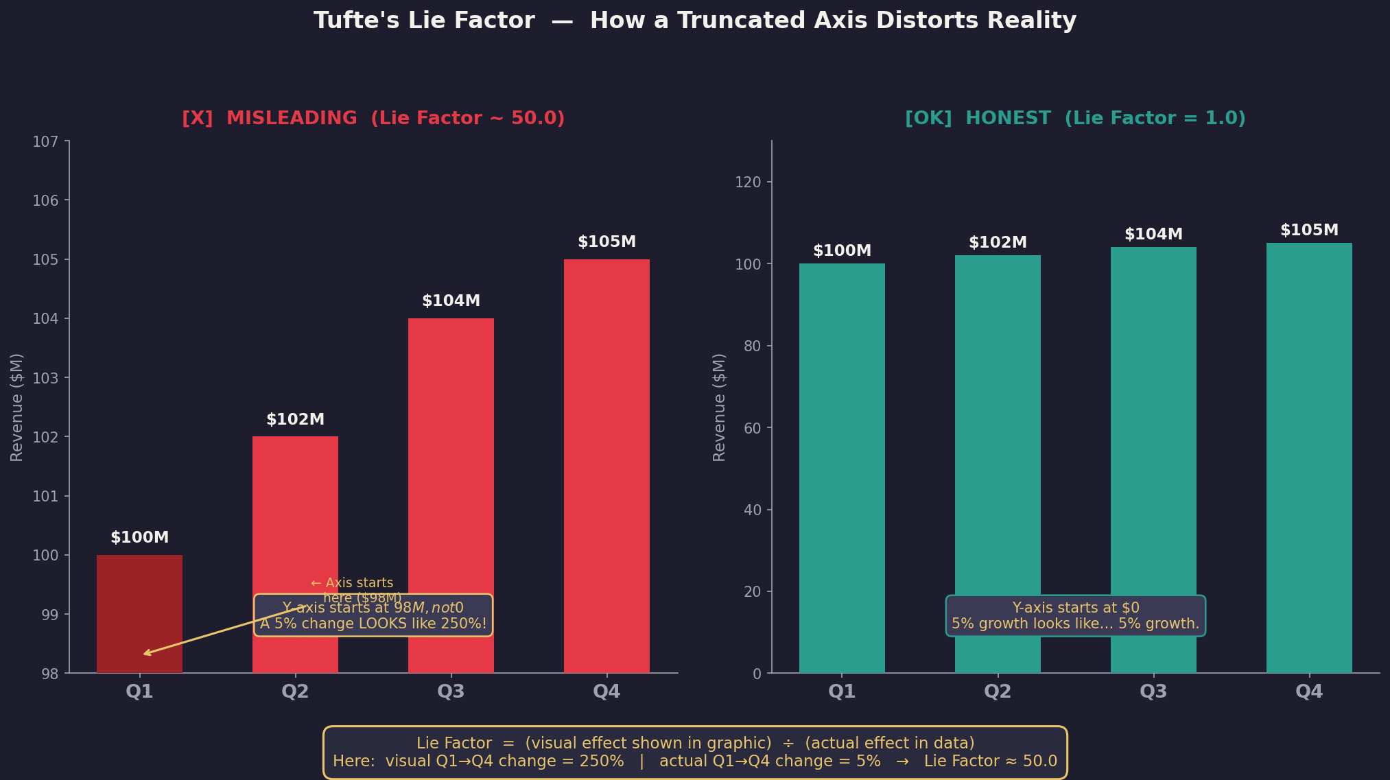
Assignment 4: Lie Factor Calculation
Calculate the Lie Factor for a misleading chart: \(\text{Lie Factor} = \frac{\text{Size of effect shown in graphic}}{\text{Size of effect in data}}\)
Here is an example image of Lie factor > 1
Visualization Example for Lie Factor Calculation
import matplotlib.pyplot as plt
import numpy as np
# Original misleading chart
data_original = [100, 150]
sizes_original = [100, 300]  # Exaggerated sizes
# Redesign chart
data_redesign = [100, 150]
sizes_redesign = [100, 150]  # Accurate sizes

fig, (ax1, ax2) = plt.subplots(1, 2, figsize=(10, 5))
# Original misleading chart
ax1.bar(['A', 'B'], sizes_original, color=['blue', 'orange'])
ax1.set_title('Misleading Chart')
# Redesign chart
ax2.bar(['A', 'B'], sizes_redesign, color=['blue', 'orange'])
ax2.set_title('Redesigned Chart')
plt.show()
- In this example, the original chart exaggerates the size of the bars, leading to a high Lie Factor. The redesigned chart accurately represents the data, resulting in a Lie Factor of 1.
Activity: Lie Factor
import matplotlib.pyplot as plt
import matplotlib.patches as patches

# 1. Define our data
data_v1 = 10
data_v2 = 20
data_increase = (data_v2 - data_v1) / data_v1 # This is 1.0 (or 100% increase)

# 2. Setup the plot
fig, ax = plt.subplots(figsize=(8, 5))
ax.set_xlim(0, 50)
ax.set_ylim(0, 30)
ax.set_aspect('equal')

# 3. Draw Square 1 (Side length = 10)
# Area = 10 * 10 = 100
rect1 = patches.Rectangle((5, 5), 10, 10, color='skyblue', label=f'Data: {data_v1}')
ax.add_patch(rect1)

# 4. Draw Square 2 (Side length = 20)
# Area = 20 * 20 = 400
# The data doubled, but the area quadrupled!
rect2 = patches.Rectangle((25, 5), 20, 20, color='salmon', label=f'Data: {data_v2}')
ax.add_patch(rect2)

# Calculation of Graphic Effect
# Graphic Increase = (400 - 100) / 100 = 3.0 (or 300%)
# Lie Factor = 3.0 / 1.0 = 3.0

plt.title(f"Visualizing with a Lie Factor of 3.0\nData doubles (10 to 20), but Area quadruples (100 to 400)")
plt.legend()
plt.axis('off')
plt.show()
Best visualizations of 2025
🧩 🚀 Checklist of Tufte’s principles
-
data-ink economy
-
absence of chartjunk
-
accurate representation
-
clear labelling
-
information density
-
integrated annotations
🧩 🚀 Summary
-
Data-ink economy — The graphic minimises non-data ink (decorative lines, gratuitous 3D, heavy backgrounds) and uses ink mainly to present data.
-
No chartjunk — There are no unnecessary ornaments, redundant gridlines, or distracting decorations that do not improve understanding.
-
Accurate representation — Scales, axes, aspect ratios and transformations do not distort the underlying data; claims are supported by the visual evidence.
-
Clear labelling & context — Axes, units, legends, titles and sources are present, unambiguous, and placed close to the relevant graphical elements.
-
High information density (where appropriate) — The visualisation communicates multiple relevant facets without overwhelming the reader; small multiples or layered encodings are used sensibly.
-
Integrated text & graphics — Annotations, captions or callouts are used to explain key patterns or exceptions rather than forcing the reader to infer everything.
-
Shows variation & uncertainty — Where relevant, variation (error bars, confidence bands, distributions) is shown rather than hiding uncertainty.
-
Readable at a glance & reproducible — The primary message is immediately identifiable and supporting code/notes allow the display to be recreated.